One A Day – 885 – HDR Comparison
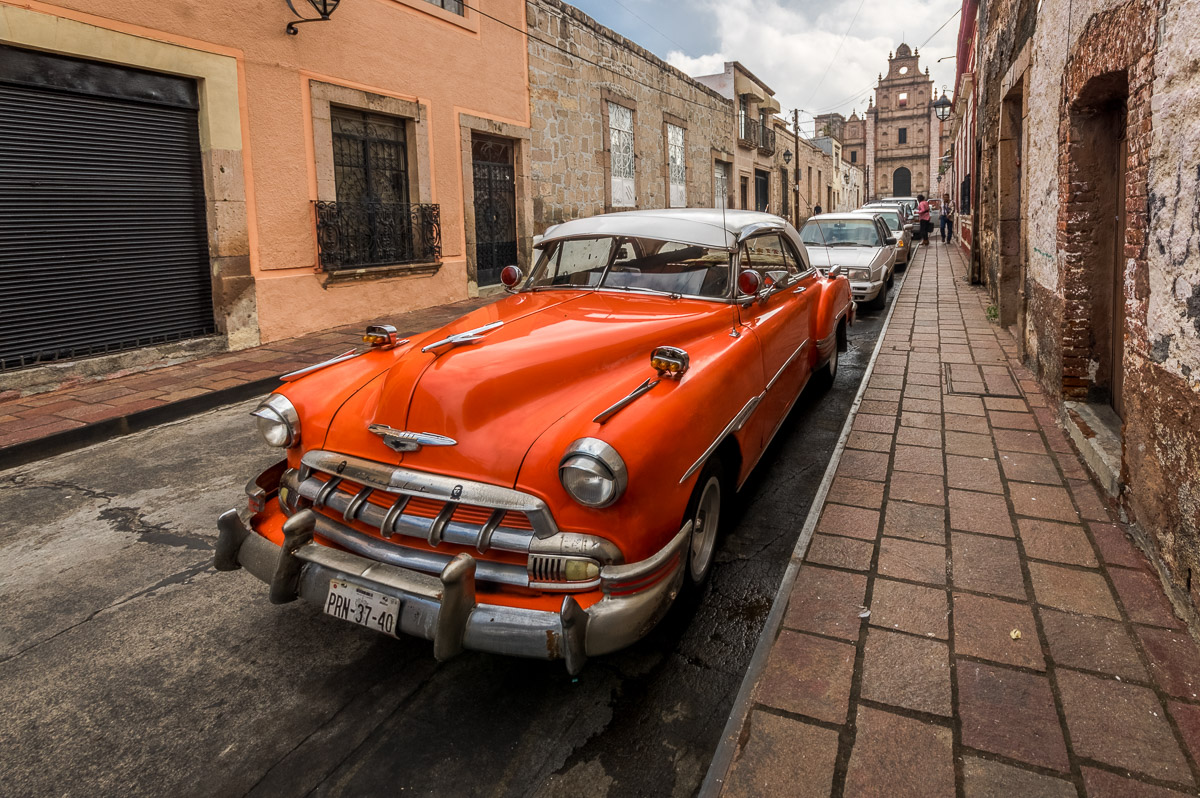
Standard – single photo, no tone mapping, no merge.
Lightroom 6.7 – Three photo merge.
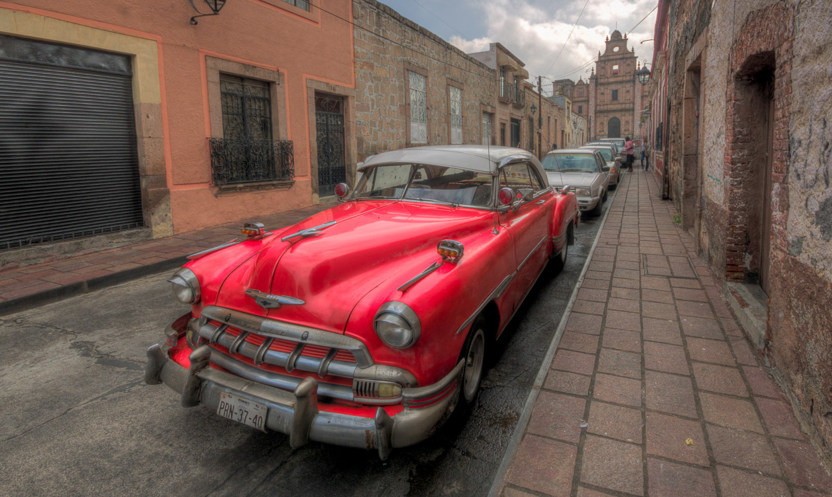
Photomatic Pro 5 – Three photo merge.
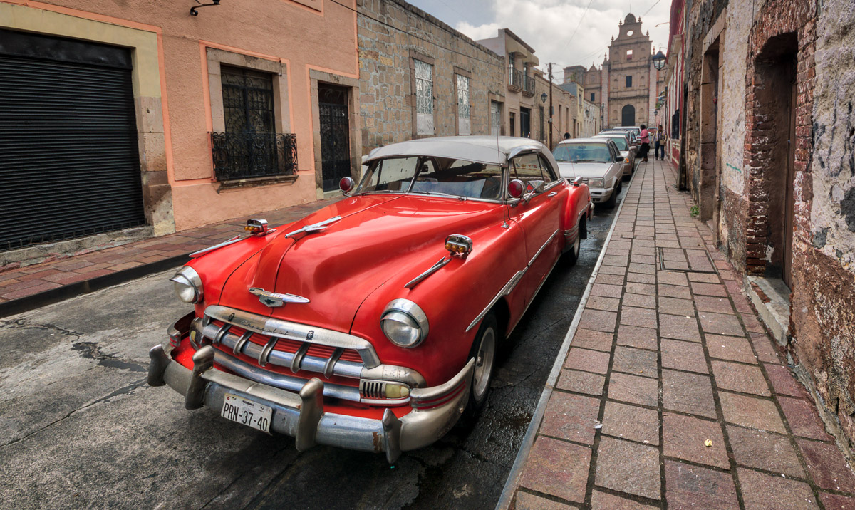
Aurora HDR 2017 – Three photo merge.
- Photowalk
- Centro, Michoacán, México
- October 3, 2016
- Copyright, all rights reserved
I like High Dynamic Range (HDR) photos and the tools are very useful for artists whether you use them strictly for naturalistic, extended range, high gamut photos or you bend images with the tools into something artistic and representative of the original scene.
The term HDR is coming into use for consumer products. Many cameras offer it as a feature now. Professional and advanced amateur photo editing programs feature options for using it. High end printers offer high gamut inks on the right paper and with images produced with proper color space and tonal spread. Soon, it is a term you will see on televisions – if you don’t already.
Honestly, it is a bit hard to see the range and depth promised by HDR on most devices you might use today and – your eye can only differentiate part of range being produced. It is a little easier to see what is happening with HDR in print on good paper with good inks – by reflected light. Because of this – a lot of the HDR we see on the internet is “over intensive.” It isn’t a bad thing – it is just true. In post editing, you tend to work towards the most dramatic interpretation and the tools are very prone to providing that answer.
I’ve been using HDR tools for a couple of years. Recently, Macphun, a developer of Apple-based photo editing apps, offered a new application, Aurora HDR 2017. I got an offer to try it as a part of a special pre-release deal – so I did. I’m not special, a lot of photographers got the same offer, but the deal was pretty good. I did some simple, three photo shots to try it against some of my other tools. The results were interesting – so I put them here for you to see.
The Setup
Three RAW (Adobe DNG, Adobe RGB color space) photos, on my Pentax K3, separated by shutter speed.
- Shutter: 1/800, 1/250. 1/80. 1/250th of a second was the measured scene average for the ISO.
- F/10
- ISO 400
- Normal daylight, slightly overcast
- Handheld, image stabilization and 3 photo bracketing on . All final photos merged from the same RAW originals. All photos post processed in Lightroom on return from merge, including vertical adjustments for the super-wide, Sigma 10-20.
- Whatever tools and options each application allows were used to their best advantage, but they were adjusted by me and final adjustments in Lightroom were made by me. There is no attempt to just show what the photo was post merge. Instead, my aim was to find out how each of these applications that I have can be best used in my context. Because of that, there is some difference in the cropping between the photos. It is just manually applied and I didn’t try to make it exactly the same for this.
Results
- The first photo in the series is just a standard photo from a single image – the normal image I would use. I use a fairly wide gamut normally by stretching both the highlights (closed) and the shadows (open) to their limits and then coming back and balancing with whites and blacks. So my photos already represent as much gamut as a normal RAW photo offers.
- The second is a native Lightroom merge of the three photos in the set. The color is pretty close to the single photo with a slight tendency to red, more detail in the highlights (a little too much for a photo on a blog), a bit more edge contrast, and shadow depth. Of all three methods, this version is the closest in color to the actual color of the car.
- The third is from Photomatix, the current version. It shows a high tendency to over saturation, pushes the reds out of normal range (loosing orange completely), and other, less strong colors, tend to be muddy. Contrast and sharpness are a mix of harsh and soft.
- The fourth is from Aurora HDR 2017. It also tends toward the red, but avoids going over the edge. It appears sharper and has more edge contrast. It also has a lot of tools I didn’t use as much as I could have, because I prefer to do standard post-processing in Lightroom as I did with all the others.
Both Photomatix and Aurora send photos back to Lightroom in tiff format. Aurora will save a version with the settings as applied in the app back to the folder where the original photos came from but it won’t do that with the final tiff. You have to use the catalog features in Lightroom to put it where it should go because otherwise it drops it rather randomly in Documents. Photomatix will put the photo where it goes and not require the extra step, but there is no way to save the intermediate steps to a separate file if you want to back and change some of the settings you applied.
For me – the Lightroom result was clearly the most naturalistic. The Aurora result is showing promise and has some advantages in easy access to contrast and color management. But it could be a lot better if it stopped trying to do everything and played better with other editors. Hopefully, it will get there. I find the ability to use sliders to modify elements in post processing good, but a bit hard to use in comparison with the smooth steps of Lightroom. Photomatix is clearly falling behind but has its uses as a tool for creative enhancements.
So – that’s my two cents…. Obviously, you’re going to see more HDR soon.


Great pictures and tips, and that classic is just amazing!
Thanks Ben! As someone mentioned on Facebook – it is often used as a stand for selling fresh bread.